In this one i have used the cutout effect filter to make the animals even more cartoon - like and animated, i have combined fushia with shredded paper to give a textured effect, i think this works well however i had saved the file wrong and joined the pink in as the background so when i changed the fill to reveal the paper underneath, a lot of the detail was lost, i will try this again but maybe in a more subtle colour.
In this one ive used a 70'as wallpaper design i found on cg textures, i like the colours and the shapes of the wallpaper itself but for this piece it can't use a background that's supposed to be square, as the center's off.
This is another 70's design from cg textures, this uses good neatral colours which fits with the theme of my work, however, the design itself is way too busy and detracts from the information being presented.
This one is also 70's wallpaper design, i really like this one as it has a great balance of not taking away from the piece, it also has a retro graphic feel to it which i really like, as this fashion has come full circle. The colours are also nicely muted to avoid detracting from the information itself. Another benefit from this background is the natural flower like forms that echo the nature context of my piece. In addition to orange and blue being complimentary colours, which immediately make the blue pertrude to the front as the colour enhances it's richness. I will definately be using this one further.
This one is another take on the gothic flock wallpaper, i like the design but in this combination it doesn't work at all, the colour's too dark and the pattern's too busy.
In this one i have used a smoke effect from cg textures, i really liked the luminous quality however, it was black and i would have had to change all my colours to make anything stand out, so i inverted the smoke itself, then changed the colour balance, i found that blue works best as it echos off the logo.
I then went on to put in a fill colour to balance out the picture as i though it felt quite harsh where the rest of the white was, i really like the way the background draws the viewers eye up and around the whole image, i also appreciate the intensity that the animals outlines actually stand out in this design.
I reverted back to my first design but used this colour that has complimented previous designs, i think it is sucessful as it has some detail to catch your eye but not too much to distract from the images. The key with getting all of these right is definately BALANCE...
In this one i tried to use feather on the owl but they didnt come out right, i wont be using this one.
i like the effect although there could be too much brown, the characters still come forward out of the background.
This one actually happened by accident, when i had a gritty texture underneath the white, however it really allows the animals to stand out without feeling like a kiddies poster, helped by the small grainy deatailing.
I choose this colour as it contrasts with the brown, it's also a very sunny happy colour which attracts attention. Blue and orange are complimentary colours which also adds to it.
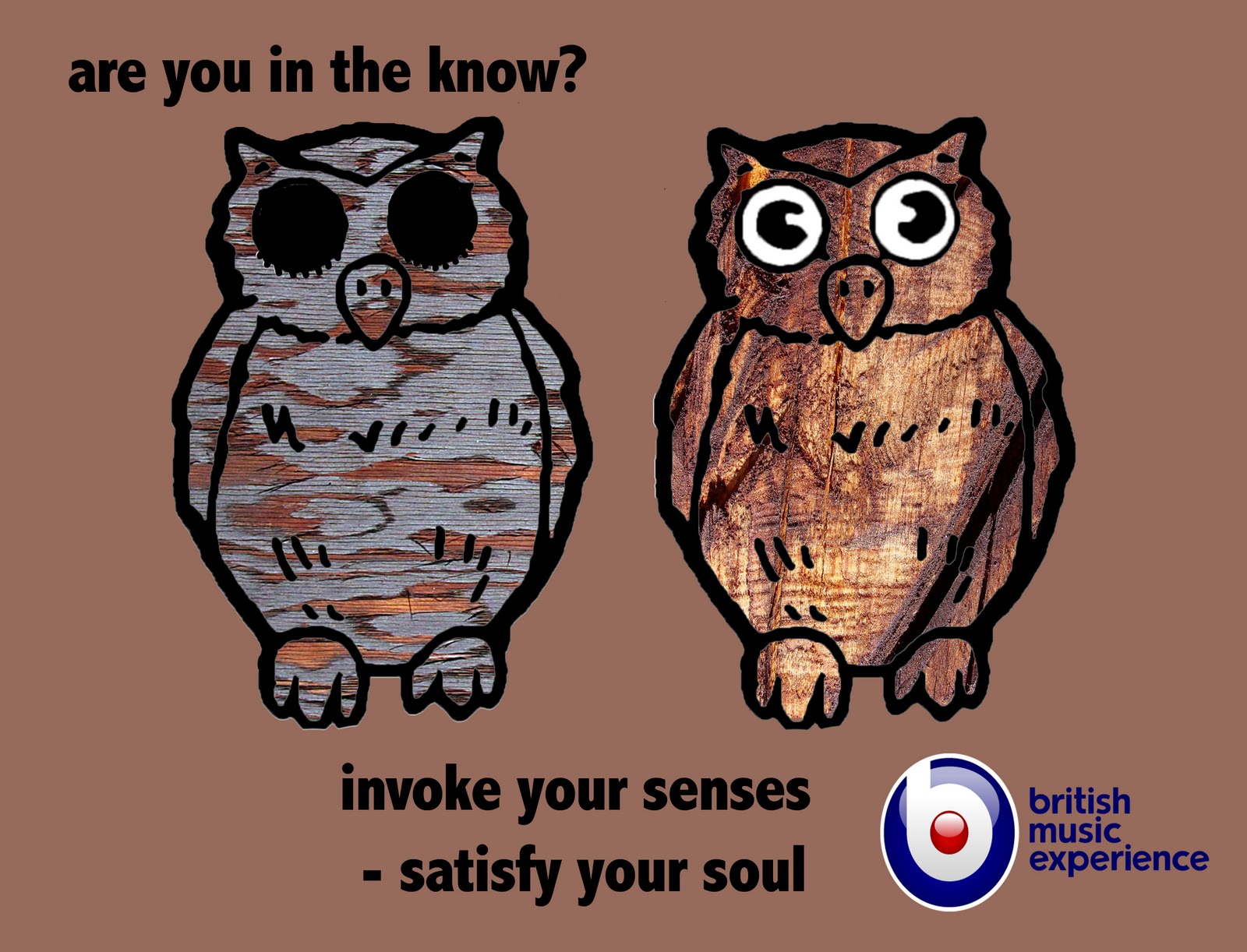
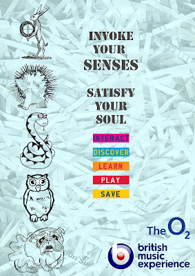
This image relates to awakening to the knowledge that is BME, it also poses a direct question to the audience, are YOU in the know? The background needs more detail in, unfortunately it wouldnt work.
This is my tube poster design which i'd hoped would seem as if the owl was blinking.
This is my bear version of Abbey Road which i personally prefer due to the bright colours.


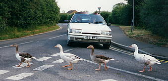
 Due to the Beatles covering up a lot of the information behind them, it would be very complex to try and remove them, so the solutions were to montage animals into the Beatles or just join them together in one image. When trying to put the ducks on the Beatles heads it ended up looking ridiculous and not working, i then planted them in together in one image, after evaluating this, the ducks and the concept altogether was no prominent enough.

 Playing around with text, i like the way it seems to fit in with the zebra crossing, however when you blow text up this big it distorts and blurs. Is this clear enough what the image is or is the text taking over?